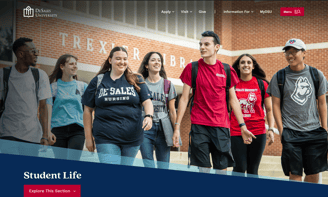
DeSales University
Project Overview
This project was a collaboration through and through. Our team's other designer and I worked together to meet this wonderful client's needs. Through rounds of collaborative/live-design sessions we brought to life a website that gives content owners the world and prospective students everything they need to find the information that will shape their college decision. The homepage and program pages were designed by my colleague, while I provided guidance as a consultant. I designed the landing and interior page templates, building on the homepage standard she set. I loved this project for its collaborative nature and the end result is a tricked out set of templates that provide so many unique opportunities for content design. This site is live - visit DeSales now!
My roles: UI/UX Designer
My responsibilities: Requirements gathering, ideation, wireframes, mockups, iterating
Design created using Adobe XD. Website built in the Cascade CMS.

Modules
Our templates, designed for Cascade CMS are modular, built with flexible components to make content design easy!
We begin with a one-column section that is perfect for introducing page content. This section is available with different background colors to keep things interesting and organized.
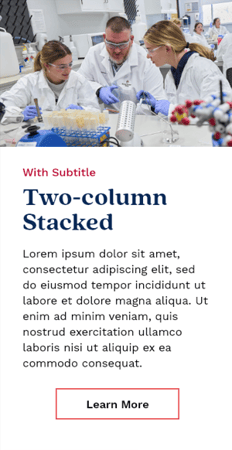
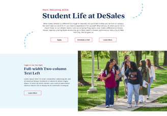
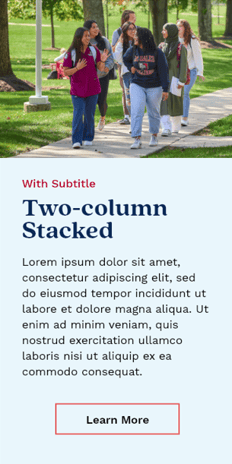
The two-column component is built to flip between showing the image on the left or the right, opposite the text to allow for interesting layouts.
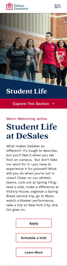
Impact Area
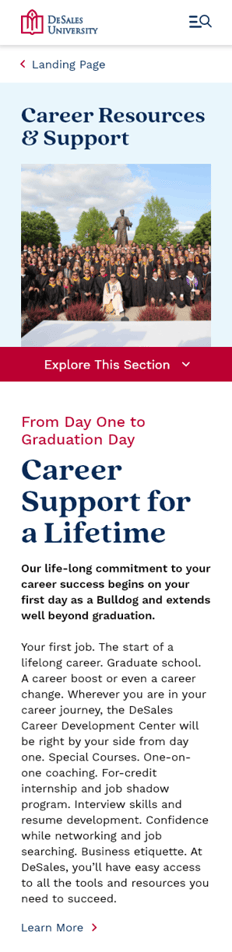
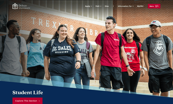
Building on features of the homepage, I brought the diagonal lines into the landing page impact area. DeSales is able to showcase large imagery and a drop-down interior navigation has been employed to give users easy access to additional pages.
All global elements seen on these pages were created by my colleague and carried through the rest of the design.
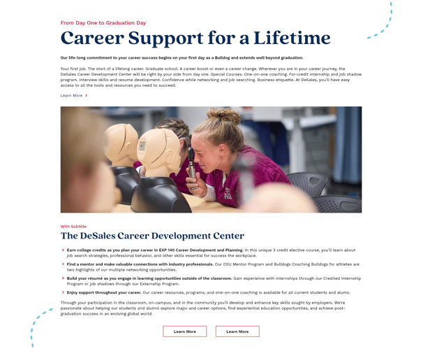
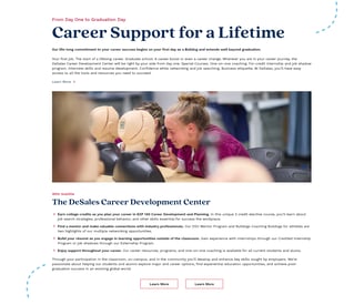
Landing Page
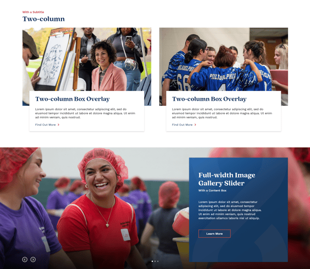
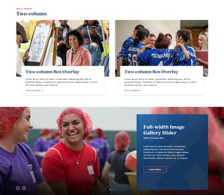
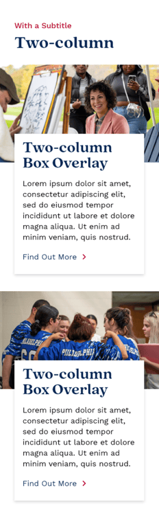
The two-column with box overlay allows for snippets of information with CTA links to help users find the lower-tier pages that they need.
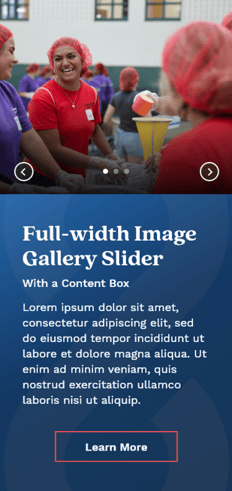
A full-width gallery slider can be used on pages to showcase large imagery, highlighting campus experiences.
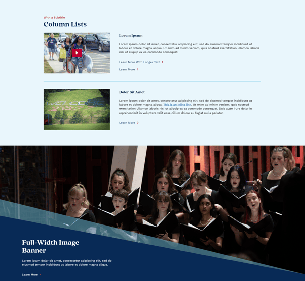
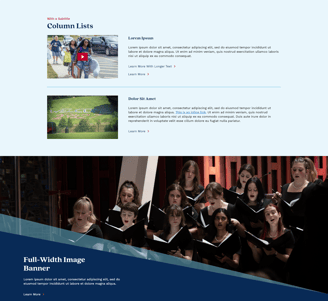
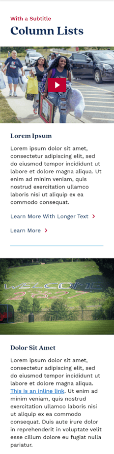
The column list component can be used with different color backgrounds to organize content. Video can be used here, just like in all of the media placeholders.
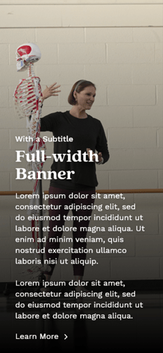
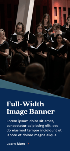
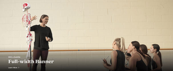
The full-width banner gives another area for large imagery and pulls in the diagonal shapes of the brand. Large CTA banners like this can be used anywhere on the modular page to break up content or highlight important information.
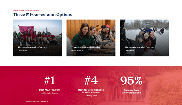
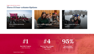
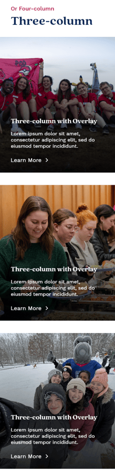
A classic three and four-column component is included as well - these are perfect for landing pages as the hover effect reveals a little text and allows the CTA to do the talking.
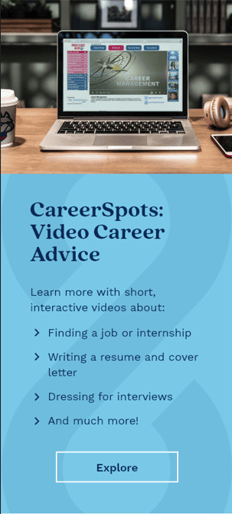
The infographic banner got a slight modification from the homepage to be used on landing pages. It can be used to highlight high-level information.
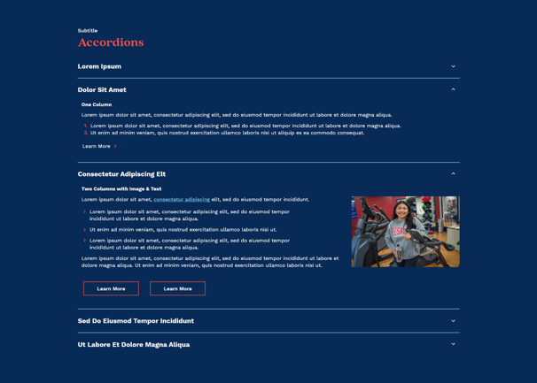
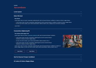
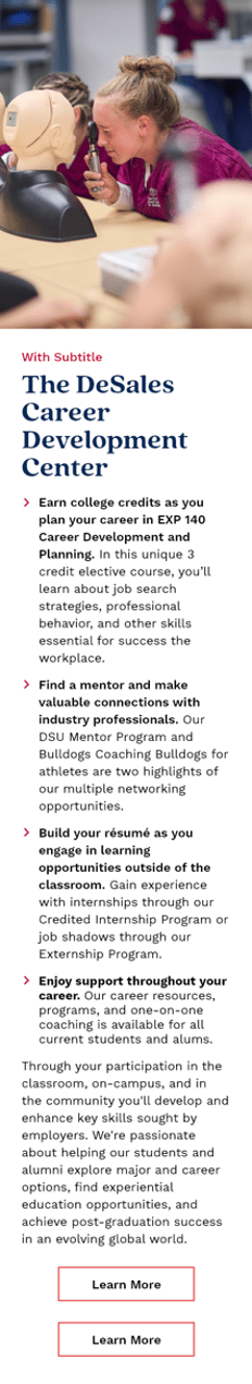
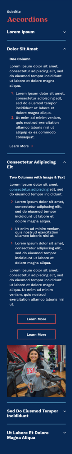
Accordions are another useful component that can be used to showcase information like FAQs with lists, inline links, buttons, and images. These are available with different background colors as well.
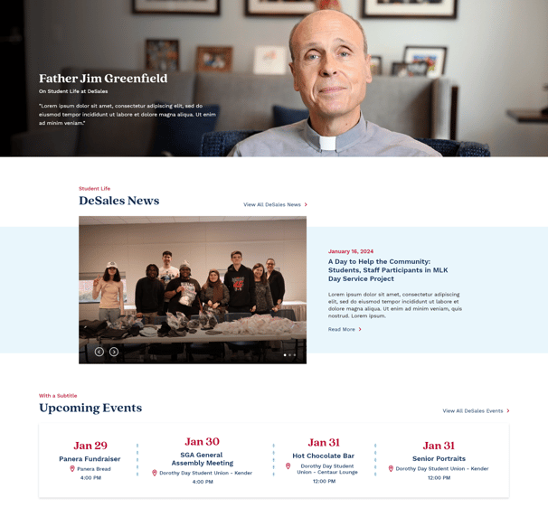

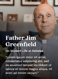
A quote banner is another full-width option for breaking up page content and highlighting real human experiences at DeSales.
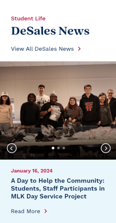
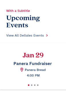
The news slider and events bar are modifications of the homepage news and events components, altered to suit the landing and interior pages
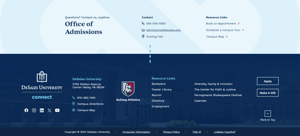
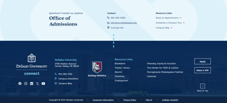
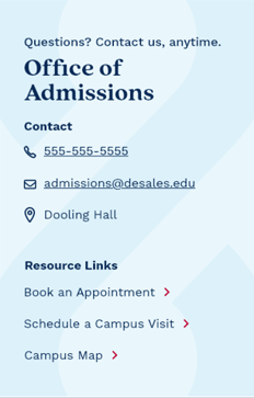
Finishing out the page is a contact banner, a widget content owners can place at the bottom of any related pages so that users can easily reach out. This widget also contains resource links to provide additional navigation.
The footer, like the other global elements was designed by my colleague and can be seen throughout the site.
Landing Mobile Gallery
Click to open full-screen previews of images. Sunnydale's homepage redesign is responsive to reach students no matter which device they're using.

This one column is notably wider than the landing page version because interior pages tend to be more content-heavy. This allows for more room for text, images, lists, and buttons to accommodate all the info necessary.

Impact Area
The Interior pages share some components with the landing page, so here I'm showing only the unique pieces created for the more content-heavy lower-tier pages.
The impact area for the interior features a more square image which will be easier for content owners to source as they build out hundreds of interior pages. The drop down navigation is consistently placed however to provide a seamless experience. Interior pages also utilize breadcrumbs for additional navigation.
Interior Page

Another unique interior component is the full-width banner. On hover, this design reveals additional content as well as the CTA to keep users moving through their journeys.
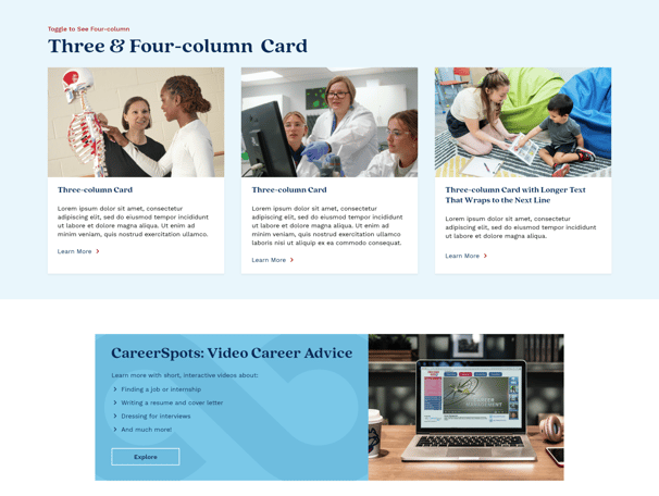

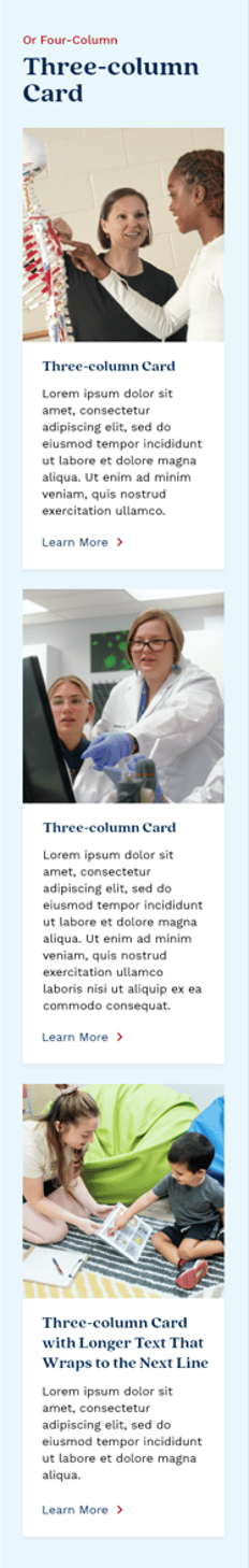
Three and four-column card components are great for organizing content especially with different background color options.
A narrower CTA banner is included on the interior templates as well to give content owners a place to highlight services, programs, and more.

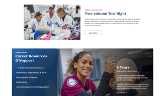
A smaller, simpler two-column is included on the interior pages, allowing the content to be the focus.
A tabbed section is also added here, to give another way (in addition to accordions) to create categories of information. Users can click between the tabs to learn about different subtopics connected by an overall theme.
Interior Mobile Gallery
Click to open full-screen previews of images. Sunnydale's homepage redesign is responsive to reach students no matter which device they're using.